Let's Talk Web Menus


61 % of users say they’ll leave a website if they can’t find what they’re looking for within about five seconds. That means confusing menus or unclear navigation can literally send people to a competitor almost instantly.
At Yellow Lime, we’re big fans of menus that actually work for the people using them. So let’s talk about how to simplify your web menu and make it easier (and nicer) for your visitors to get around.

See Things From Your User’s Perspective
Here’s the thing: your users don’t care about your internal departments or project names. They care about getting what they came for, and finding it fast.
Your menu may make sense to you, but think about getting a second opinion. From someone who maybe… doesn’t work in your organization.
Take GodwinPlumbing.com, for example. Instead of overwhelming visitors with a dozen technical service categories, we designed their menu to guide users to what they need most—like home services with clear labels and coupons. No fancy jargon or “clever” terms. Clear, simple, and helpful.
A good test? Ask yourself:
- A simple test: Would a new visitor understand this right away?
- Would they click it confidently, or pause and wonder what it means?
If it’s the latter… it’s time to simplify.

Cut the Clutter
It’s tempting to include everything in your menu. (“What if someone needs that one PDF from 2012?!”) But here’s the truth: less is more.
Focus on your most important pages (good rule of thumb is usually 5 to 7 main items). Use clear, everyday language. Instead of “Engagement Solutions,” say “Get Involved.” Instead of “Resources Repository,” say “Downloads” or “Tools.”
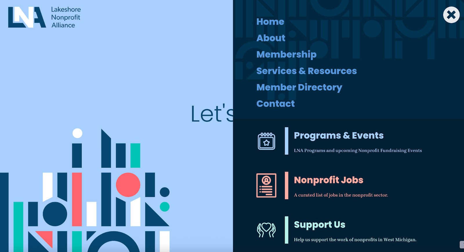
Another one of our favorite websites, LakeshoreNonprofits.org does this beautifully. It keeps things tight and clear, with easy-to-understand sections for “Members,” “Events,” and “Resources.” Visitors know exactly where to go while keeping their top 3 pages large and in charge.

Mega Menus: The Buffet of Navigation
Okay, you caught us, yes, sometimes, more options are actually a good thing. That’s when a mega menu can really help. Think of it like a well-organized buffet: everything’s in plain sight, grouped nicely, and labeled so it’s easy to find.
The trick? Keep it easy to skim and scan. Group related links under simple headings and give things some breathing room so it doesn’t feel crowded.
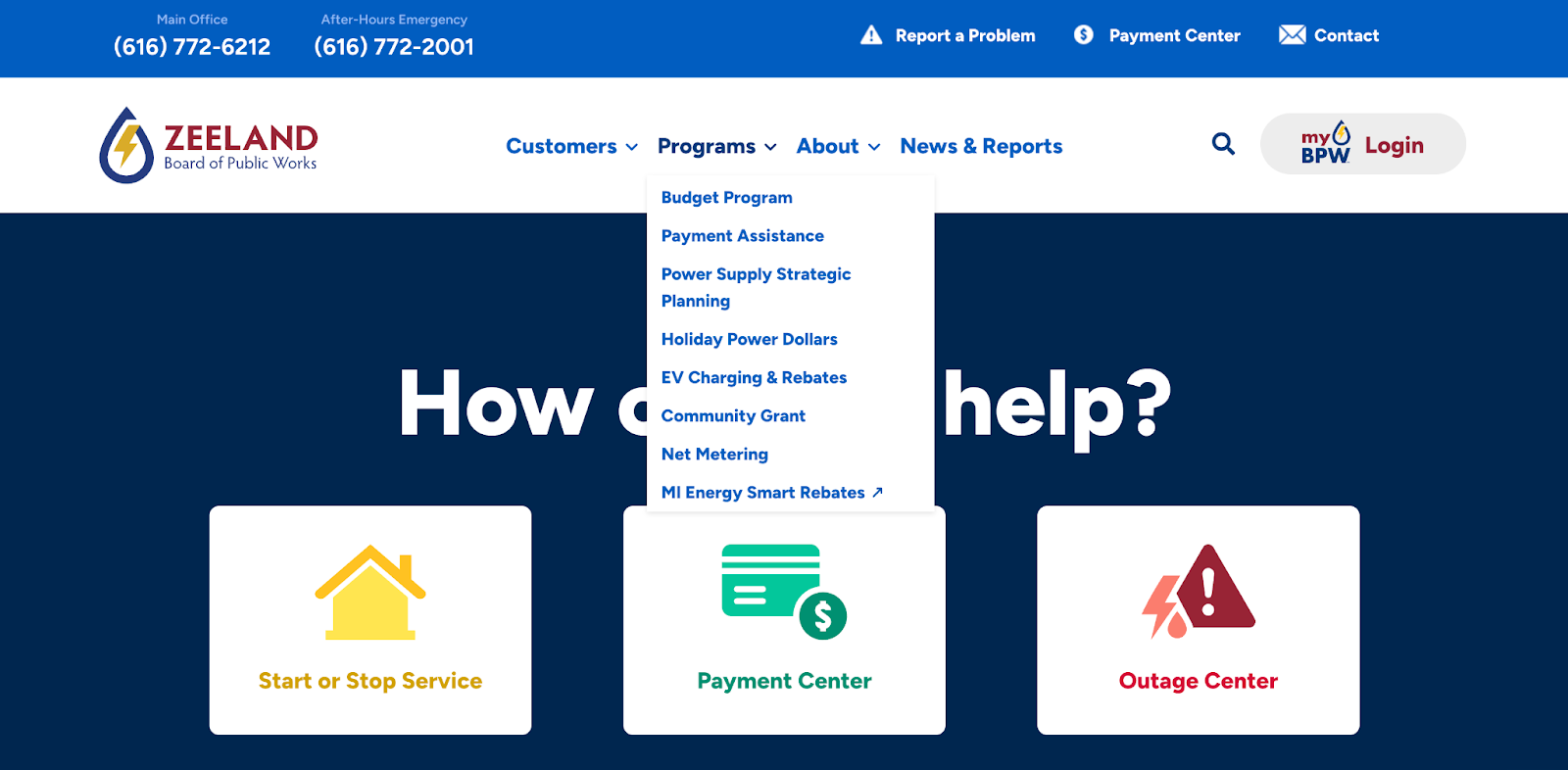
ZeelandBPW.com nails this approach. Their mega menu makes it easy to find service info, billing details, and community updates, all without feeling cluttered. It’s a great example of “more” done right.

Tips for a Menu That Actually Makes Sense
Need a quick win or two? Try these tips:
- Limit main navigation items to 5–7 max.
- Use plain language: pretend you’re explaining to a friend.
- Declutter dropdowns: merge, remove, or reorganize.
- Test it with users (or friends!) to see if they can find things easily.
- Check it on mobile: your menu should be just as friendly on a phone as a desktop.
Make Your Menu Simple and Clear
A website menu should make it easy for people to find what they need—fast. When it’s simple, clear, and designed with your audience in mind, everyone wins.
So here’s your to-do: simplify your web menu. Your visitors (and your analytics) will thank you.


